.png)
.png)
.png)
Compliance Risk Assessment Tool
At a glance
The challenge
- Manual, Excel-based evaluations prone to inconsistency
- Results dependent on manual interpretation by lawyers
- Frequent legal updates made outputs quickly outdated
- Limited scalability, could not be used directly by prospects
The solution
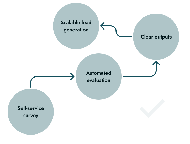
A digital assessment tool that standardizes evaluations, automates risk calculation, and translates legal complexity into clear results and actionable compliance plans.

Standardized legal evaluation

Automated risk calculation

Actionable outputs

Lead magnet tool
Context
Compliance decisions relied on manual processes that limited accuracy, scalability, and business opportunities.
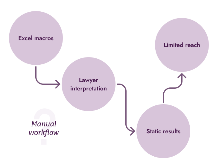
The firm previously conducted compliance assessments using Excel with macros, requiring a lawyer to interpret results and finalize outputs. This limited scalability and introduced inconsistencies, especially as regulations changed frequently.
At the same time, the firm aimed to position itself as a modern, technology-driven practice and expand its reach through digital channels like webinars and conferences. A self-service tool could both improve internal processes and act as a lead generation mechanism.
Manual evaluation process
Frequent legal updates
Limited scalability
Business goal: Digital Lead Generation
Before
After
My Role
I worked as a Product Designer, collaborating closely with a business analyst to translate complex legal logic into a clear and usable digital experience.
My focus was on making the tool accessible to both legal professionals and non-expert users, ensuring clarity in both the evaluation process and the results.
What I owned:
- UI design and overall product experience
- Interaction design for the survey flow
- Design of results and reporting outputs (Gantt + PDFs)
- User testing to validate clarity and usability
What I didn't own:
- Legal interpretation and compliance logic
- Survey content and regulatory framework
- Backend calculation logic
Approach and Strategy
Designing this tool meant translating complex legal compliance into a clear, actionable experience, helping users understand their risk and what to do next without overwhelming or alarming them.

Make risk inmediately understandable
Users needed to quickly grasp their situation: level of compliance, potential penalties, and urgency.
.png)
Balance clarity with emotional impact
The experience needed to communicate serious consequences without creating unnecessary alarm.
.png)
Translate complexity into action
Legal evaluations were transformed into a structured, actionable plan.
Guide users through complex input
The survey was long and detailed, so the experience was structured to reduce friction, to keep users oriented and increases completion rates
The tool needed to serve both legal professionals and non-expert users, requiring a balance between legal precision and accessible language. Technical accuracy was preserved while key insights were translated into plain language for clarity.
Key decisions and iterations
Key decisions focused on making legal risk understandable, actionable, and usable for both experts and non-experts.
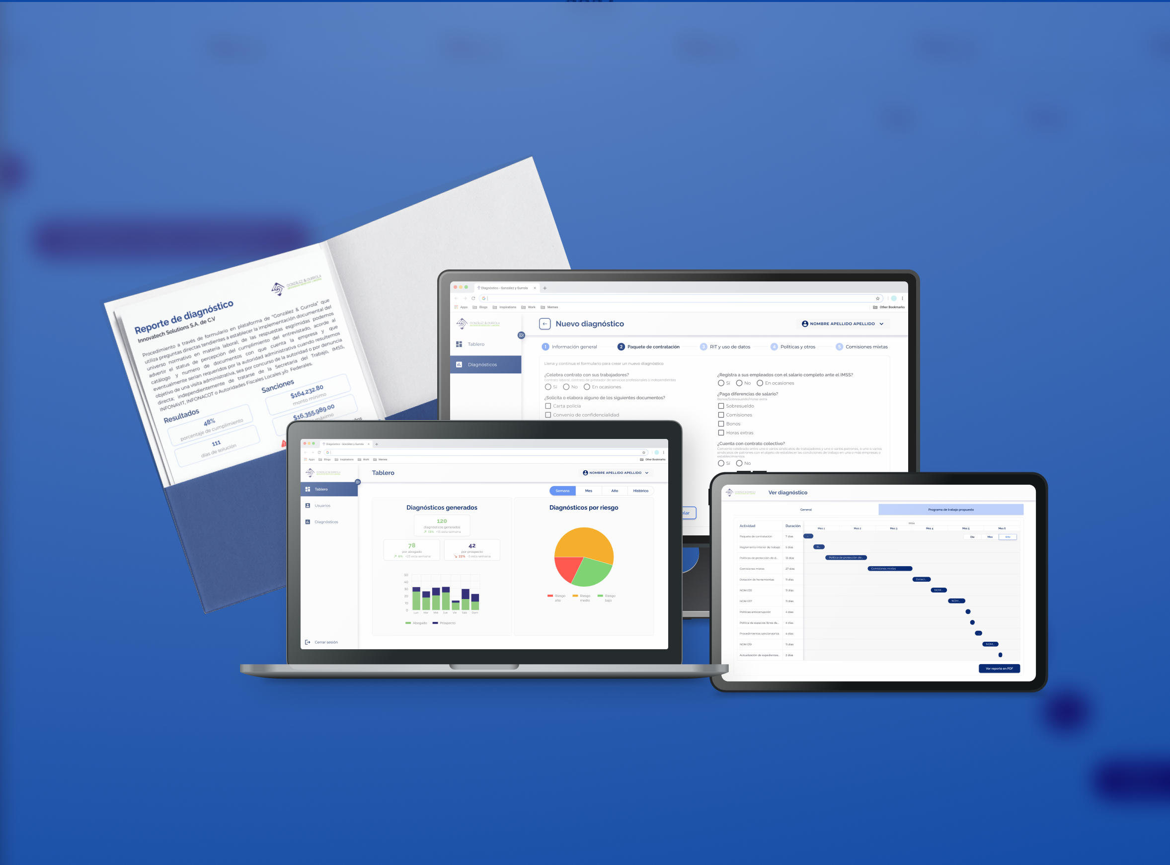
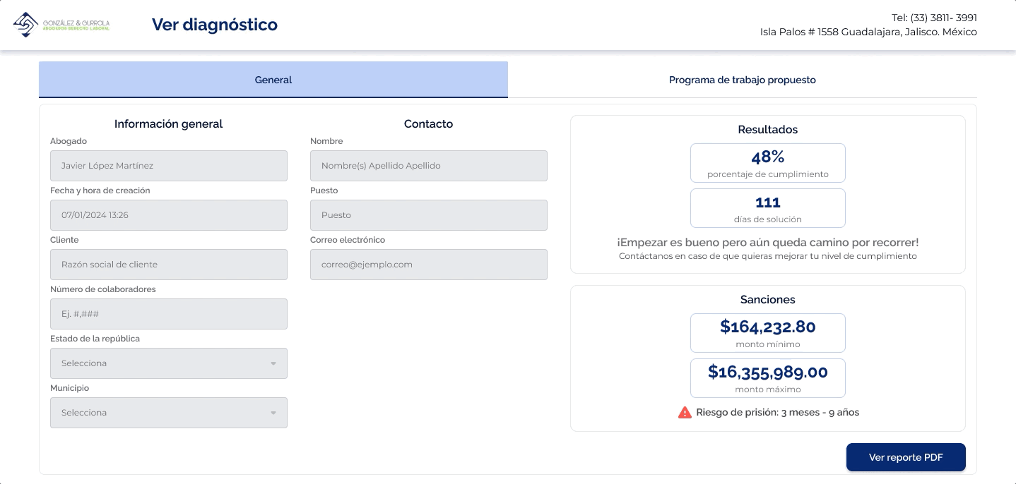
Structured risk summary at a glance
Instead of presenting dense legal output, results were organized into a clear, scannable summary.
- % of compliance and estimated time to resolve
- Monetary penalty range (min–max)
- Legal consequences highlighted when applicable
This allowed users to immediately understand “how bad it is” without needing legal interpretation.
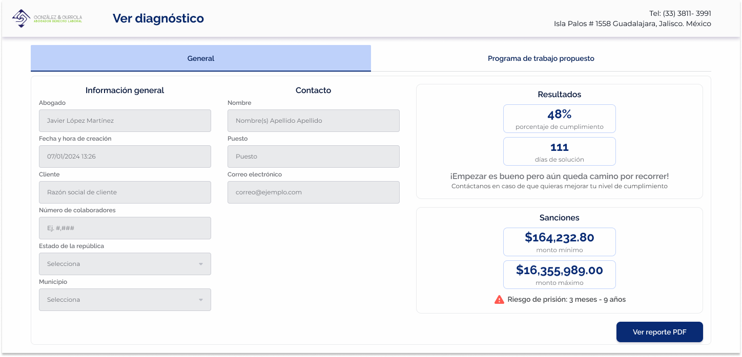
Visual cues for critical risk
To highlight urgency without overwhelming users, visual signals were introduced:
- Red alert icon for severe consequences (e.g., jail risk)
- Clear separation between informational vs critical data
- Hierarchy to guide attention to the most important elements
This ensured serious risks were visible while keeping the experience controlled and readable.
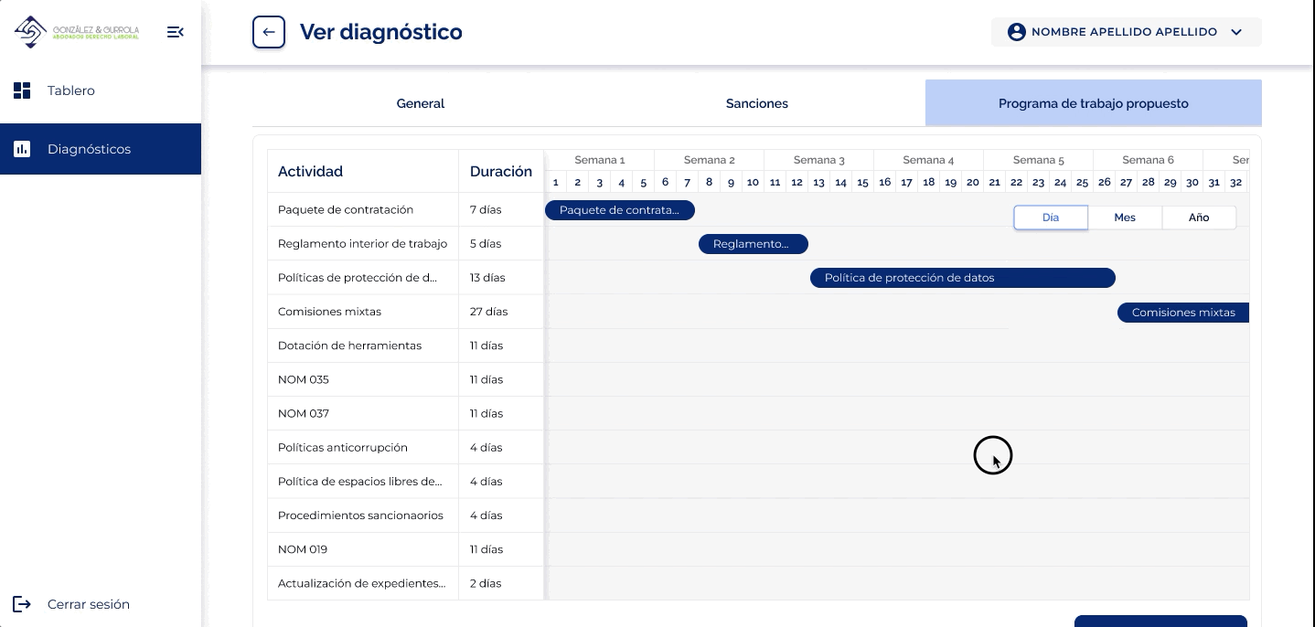
Gantt-based compliance roadmap
Instead of stopping at diagnosis, the tool provides a structured path forward.
- Phases with defined timelines
- Tasks grouped by priority
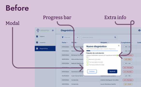
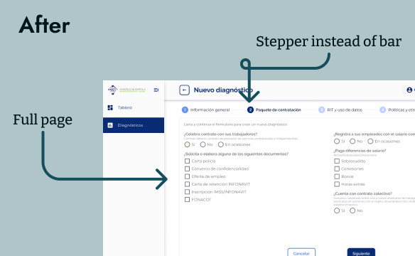
Rejected: Modal-based survey flow
An early approach explored presenting the survey inside a modal with a progress bar.
This format proved insufficient for the complexity and length of the questionnaire:
- Limited space reduced readability
- Harder to group and understand categories
- Increased cognitive load as questions scaled
The final approach moved to a full-page survey with a stepper, allowing:
- Clear categorization by topic
- Better readability for long-form inputs
- A stronger sense of progress without constraining space
This reduced cognitive load and helped users move through the process without feeling overwhelmed.
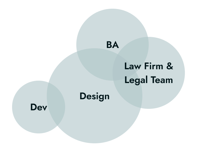
Collaboration and Alignment
I collaborated closely with a business analyst and the client’s legal team to translate complex regulatory logic into a clear and usable product.
- Developers (Front-end & Back-end):
Worked closely to ensure the survey flow, results logic, and outputs were technically feasible and scalable. Iterations focused on aligning UI behavior with calculation logic and data structure. - Legal Team:
Provided the regulatory framework and validated that outputs remained accurate and compliant. Collaboration focused on preserving legal meaning while improving clarity for non-expert users. - Business Analyst:
Partnered to structure the evaluation logic, align user flows with business objectives, and ensure the tool supported both internal use and lead generation. - Firm Stakeholders:
Aligned on product goals, tone of communication, and the balance between risk transparency and user trust.
Results and Impact
The tool transformed a manual, expert dependent process into a scalable, self service system for evaluating compliance and generating actionable insights.
.png)
Standardized evaluations across the firm
.png)
Reduced dependency on manual calculation
.png)
Enabled scalable lead generation
.png)
Improved clarity for non-expert users
.png)
Actionable outputs for faster engagement
Lessons and Reflections
Designing for legal risk reinforced the importance of clarity, validation, and aligning assumptions with real user needs.
What I’d repeat
Close collaboration and continuous critique were key to improving the product. Applying a “kill your darlings” mindset helped prioritize clarity over personal preference, while early testing with non-expert users revealed usability gaps that wouldn’t surface with domain experts alone.
What I’d do differently
I would invest more time upfront aligning with stakeholders on what information truly matters in the dashboard. Early assumptions led to iterations that could have been avoided with deeper initial discovery.
Next steps
- Improve reporting outputs based on real client usage
- Explore deeper integration with internal workflows for follow-up and conversion
Other projects
Public Transport Management Platform
Design System | Aleate
Lead System Designer
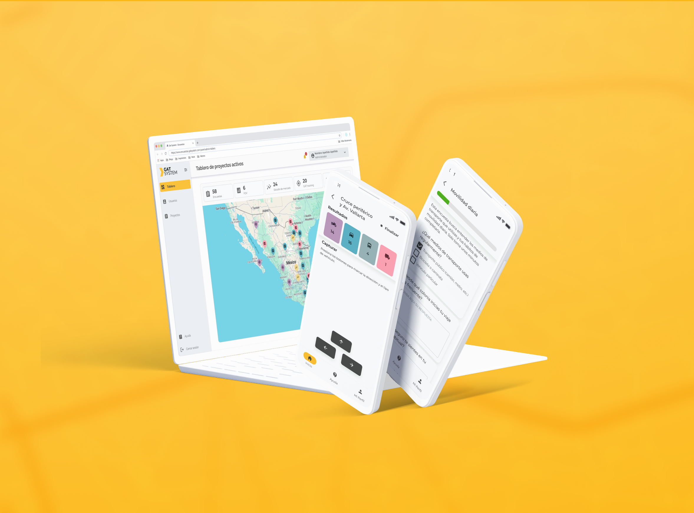
GAT System
Product Designer