.png)
.png)
.png)
Aleate | Design System
At first glance
The challenge
- Aleate is a consultancy specialized in digitalizing business processes through custom B2B and B2C software.
- Our delivery pace was slowed by repeated UI work, inconsistent interfaces, and misalignment between designers and developers.
The solution
I initiated and led the development of a scalable design system, a shared foundation that streamlined design, improved handoffs, and helped our teams ship faster without sacrificing quality.

Consistency and alignment between design and development

Design time and rework across projects

Adopted across 8+ enterprise web apps
Context
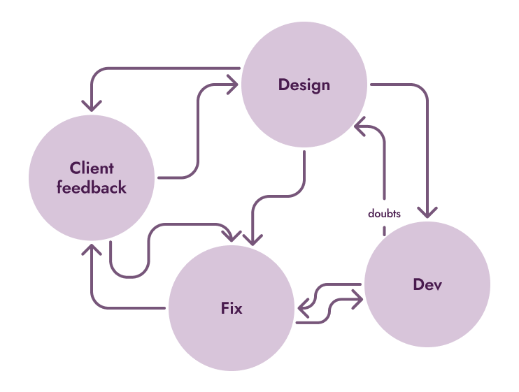
Aleate’s model depended on shipping fast, custom digital platforms for clients. But speed created chaos.
Each new project had its own components, styles, and code. Designers weren’t aware of Angular’s technical constraints, and developers couldn’t fully interpret design intent. The communication was unefficient.
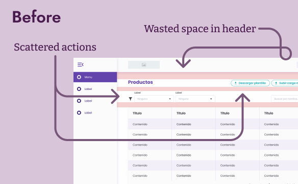
Duplicated design work
Misaligned interfaces between projects
Missed deadlines (two projects were delivered late)
Frustration across teams
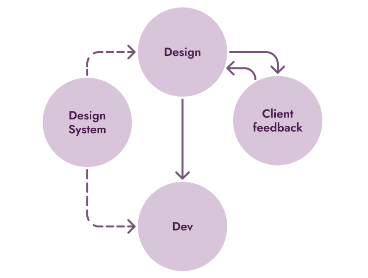
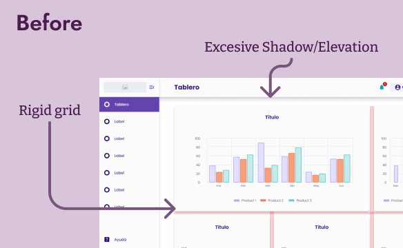
Before
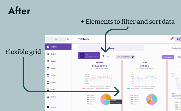
After
My Role
At first, I was the advocate for the idea. After gaining buy-in from the CEO, PM, and dev team, I became the lead designer responsible for defining, building, and maintaining the system.
Key contributions:
- Conducted the initial audit and identified high-impact components (buttons, tables, charts, inputs, layouts).
- Created the Figma base library and guided its integration into Angular and other frameworks.
- Collaborated with developers to iterate on component behavior and constraints.
- Documented usage, conventions, and naming for cross-team clarity.
- Led the system’s revival and adoption campaign after a dev team restructuring.
Approach and Strategy
We didn’t start by designing everything. We started by fixing what hurt most.At first, I was the advocate for the idea. After gaining buy-in from the CEO, PM, and dev team, I became the lead designer responsible for defining, building, and maintaining the system.

Start small, iterate fast
Focused on high-impact, reusable components to build momentum.
.png)
Collaborate deeply
Weekly design critiques, async feedback, and paired sessions with devs.
.png)
Build for scalability
Used Material 3 as foundation, defined clear naming conventions, and documented every decision.
Key decisions and iterations
We iterated constantly and learned through trial, feedback, and failure.
Dashboard flexibility
Early versions forced a rigid dashboard structure. We replaced it with flexible templates that could adapt to different client needs.
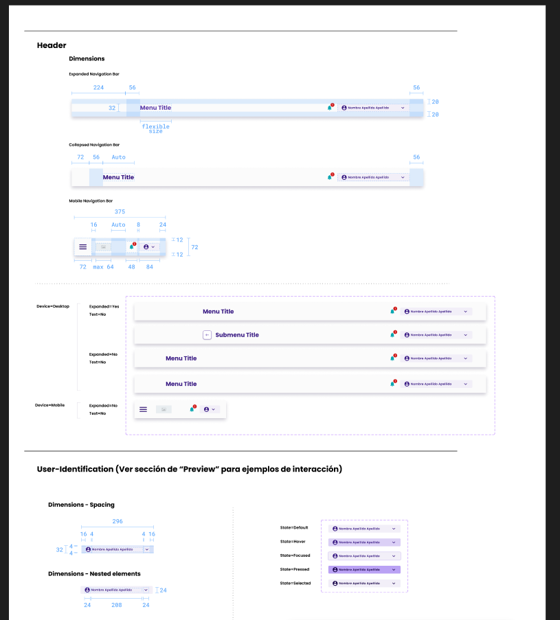
Navigation bar layout
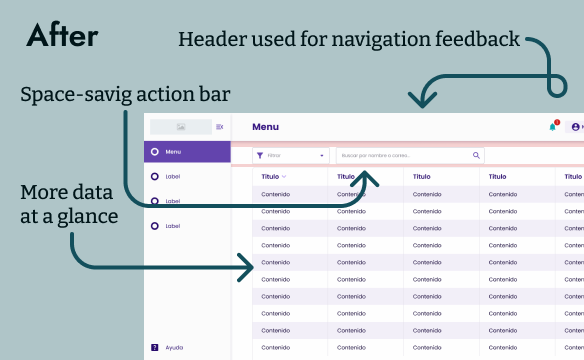
We maintained a lateral navigation bar to improve readability and screen flow. Top bars proved harder to scan and limited scalability, so we refined the side menu to be collapsible, allowing users to expand or minimize it depending on their workflow.
Tables and Data density
Reduced excessive whitespace without overcrowding data, improved readability and efficiency.
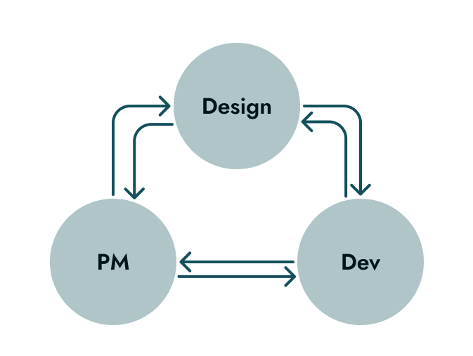
Collaboration and Alignment
The success of the design system wasn’t technical, it was human.
- Partnered with the PM to prioritize audits and improvements.
- Worked closely with the lead developer to test feasibility and refine component behavior.
- Encouraged designers to contribute via 1:1 sessions and retros.
- Reintroduced the system after a full dev team turnover, the new team quickly adopted it thanks to documentation and advocacy
Results and impact
Even without formal metrics, the results were visible in our workflow and output quality.
.png)
Reduced repetitive design work
.png)
More predictable and aligned handoffs
.png)
Consistent visual language across apps
.png)
Faster onboarding for new designers and devs
.png)
Teams could focus on client needs, not component recreation

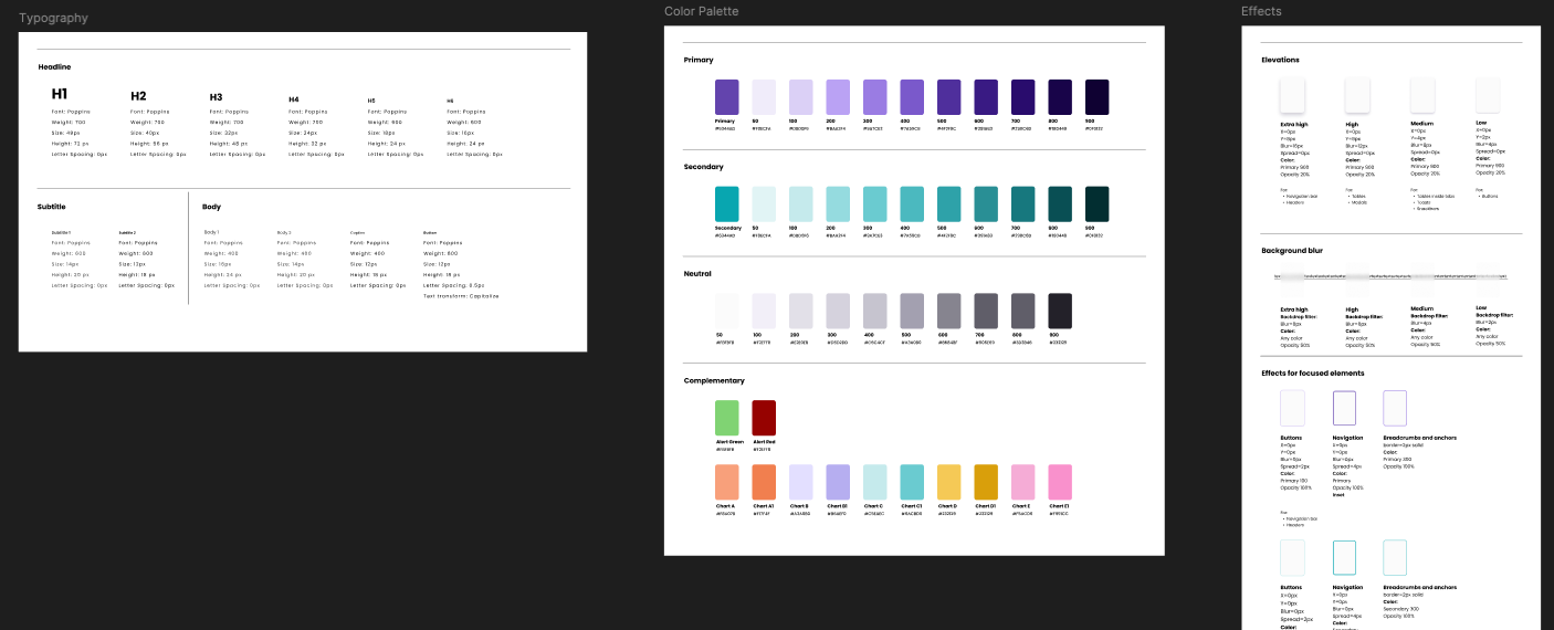
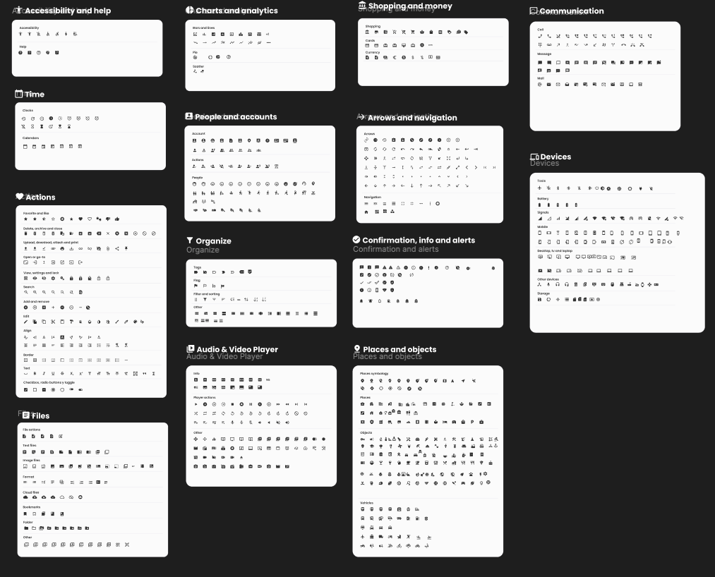
These examples show how the system is organized in practice, from foundational styles and iconography to component structure and scalability.
Lessons and Reflections
This project taught me that design systems are as much about people and culture as they are about components. Advocacy, communication, and patience are crucial to create adoption and trust.
Key contributions:
- Start with pain points that matter.
- Design systems need advocates as much as builders.
- Clarity and collaboration create scalability.
- Standardization shouldn’t kill creativity, it should enable it.
Other projects
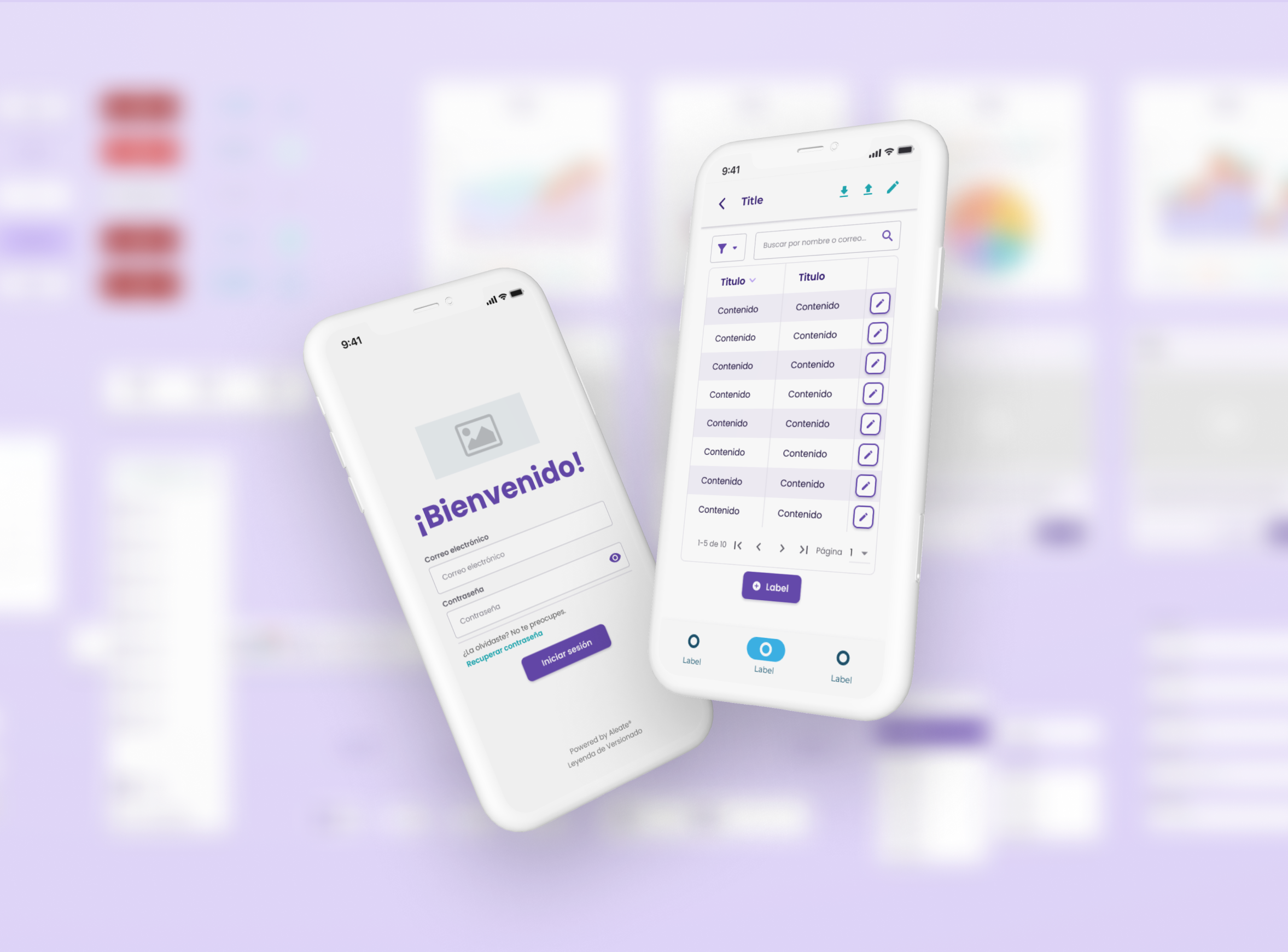
Compliance Risk Assessment Tool
Product Designer
GAT System
Product Designer
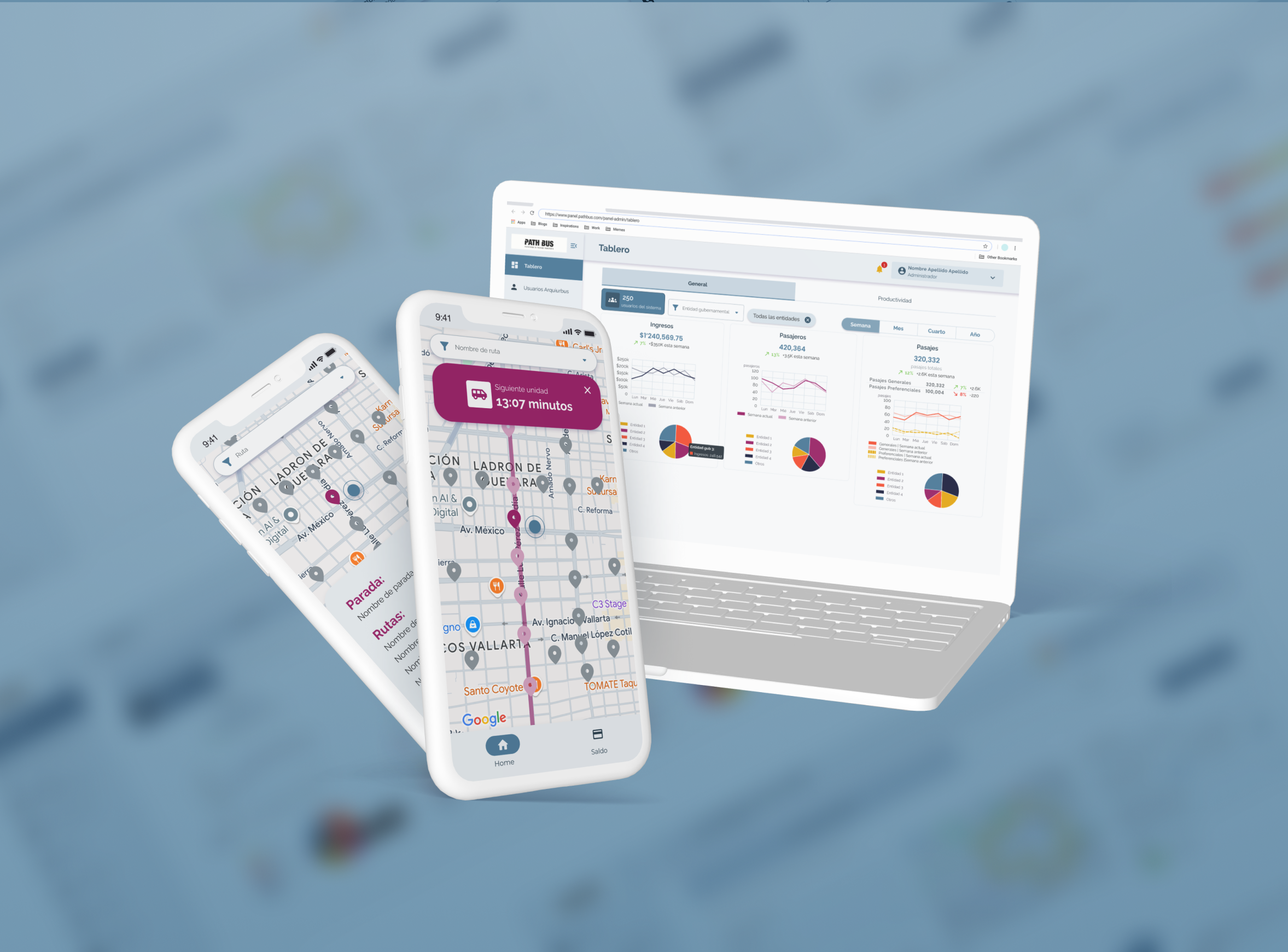
Public Transport Management Platform